ISEGSTAR USA Health Supplement Aluminum Bottle Packaging Design
Designed by Hongluotu Brand Design | 宏洛图品牌设计出品
一、设计核心定位
I. Core Design Positioning
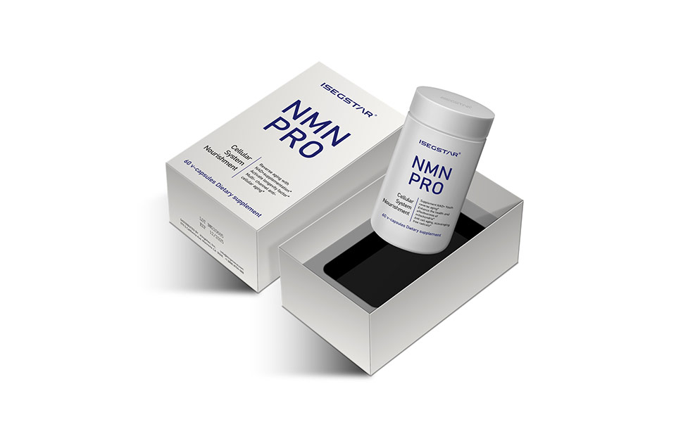
本方案由宏洛图品牌设计公司倾力打造,专为美国ISEGSTAR旗下NMN PRO、NAD+/AMPK、PQQ PRO、STEM CELL RENEW、SPERMININE系列保健品提供完整铝瓶包装设计。
This packaging design is created by Hongluotu Brand Design for ISEGSTAR USA’s product line, including NMN PRO, NAD+/AMPK, PQQ PRO, STEM CELL RENEW, and SPERMININE.
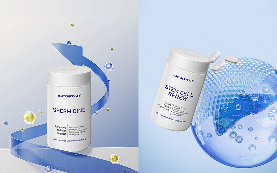
方案以纯净科技·滋养为核心创意,采用高端铝瓶材质,搭配洁白色瓶身与科技蓝色视觉系统,塑造国际化、专业严谨的美国品牌形象,传递纯净配方、科学守护的产品理念,兼顾高级质感、实用功能与强品牌辨识度,契合极简科技包装趋势与理性消费人群需求。
With Pure Technology · Precise Nourishment as the core concept, Hongluotu uses high-end aluminum bottles, pure white body and tech-blue visuals to build a professional, high-end American brand image that emphasizes pure formulas, scientific care, premium texture and strong brand recognition.
二、核心材质与色彩创意
II. Core Material & Color Design
(一)包材选择:食品级铝瓶,功能与质感兼备
1. Packaging Material: Food-Grade Aluminum Bottle
由宏洛图品牌设计精选食品级高端铝瓶作为核心包材,具备避光、防潮、防氧化、密封锁活优势,有效保护保健品活性成分,满足长期储存需求。瓶身线条圆润流畅,手感舒适,密封旋盖易用,可回收材质体现环保理念。
Selected by Hongluotu Brand Design, food-grade high-end aluminum bottles provide excellent light resistance, moisture-proofing and oxidation resistance to lock in active ingredients. The smooth rounded body and sealed screw cap ensure safe and comfortable use, while recyclable material supports sustainability.
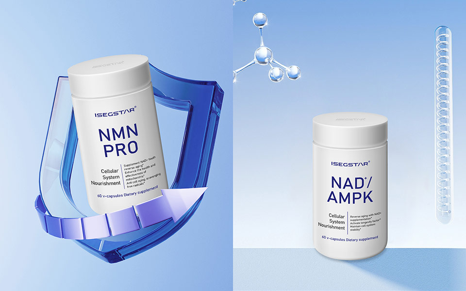
(二)色彩搭配:洁白色+科技蓝,简约专业
2. Color System: Pure White + Tech Blue
宏洛图品牌设计采用高纯度洁白色哑光瓶身 + 科技蓝(007BFF)品牌标识的经典搭配,白色象征纯净无添加,科技蓝凸显研发实力与专业品控。整体无衬线字体、层级清晰,极简大气,视觉重点突出。
Hongluotu Brand Design adopts a classic combination of matte pure white bottle body and tech-blue (007BFF) branding. White symbolizes purity and clean ingredients; tech-blue represents R&D strength and strict quality control, with clear, modern typography.
三、视觉创意设计
III. Visual Design Layout
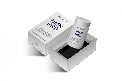
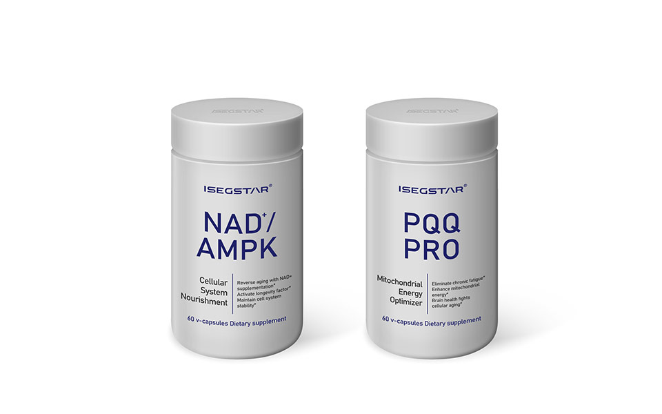
(一)瓶身正面:品牌核心,居中对称
1. Front: Centered & Symmetrical Brand Identity
宏洛图采用居中对称版式,顶部放置ISEGSTAR LOGO,下方标注USA ISEGSTAR,强化美国品牌基因;中部突出产品名称,底部标注合规信息,整体简洁高级,适合线上展示与线下陈列。
Designed by Hongluotu with a centered symmetrical layout: ISEGSTAR LOGO at the top, “USA ISEGSTAR” below, product name in the middle, and compliant information at the bottom for a clean, premium look.
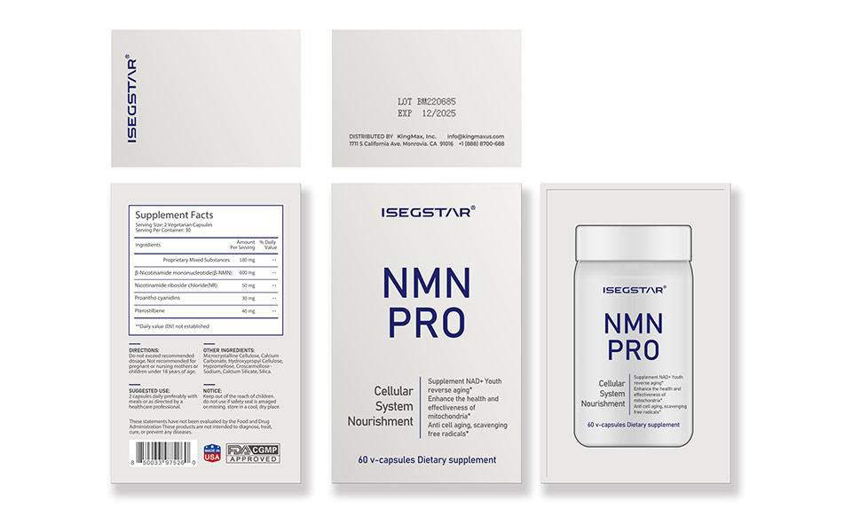
(二)瓶身侧面:信息清晰,合规透明
2. Side: Clear & Compliant Information Layout
侧面分层排版,左侧标注配料、含量、食用方法、保质期;右侧呈现进口资质、生产编号,并加入极简分子科技线条,由宏洛图统一规划视觉逻辑,实现信息透明与科技感兼备。
Hongluotu organizes information in clear layers: ingredients, dosage, directions and shelf life on the left; import certification and production codes on the right, paired with minimal molecular tech lines for transparency and professionalism.
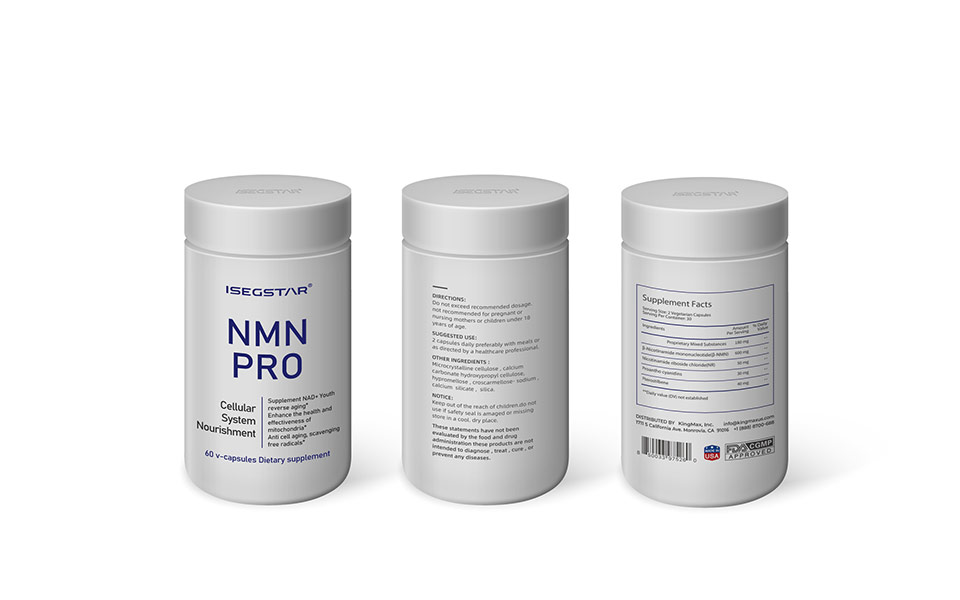
(三)瓶盖与瓶底:细节统一,强化品牌
3. Cap & Bottom: Unified Details for Brand Consistency
瓶盖采用哑光白铝盖搭配蓝色LOGO;瓶底标注批号、日期、产地,细节设计均由宏洛图品牌设计统一把控,提升整体质感与品牌记忆点。
The matte white cap with blue logo and marked bottle bottom (batch number, date, origin) are uniformly designed by Hongluotu for enhanced texture and brand recognition.
四、工艺与场景化升级(宏洛图创意设计)
IV. Craft & Scenario Upgrade (by Hongluotu)
(一)工艺升级
1. Craftsmanship Upgrade
宏洛图采用哑光磨砂瓶身、丝印蓝工艺、局部UV处理,提升手感与立体感,防指纹、耐磨损,强化高端保健品质感。
Hongluotu applies matte frosted finish, blue hot stamping and local UV coating to improve texture, anti-fingerprint performance and wear resistance.
(二)多场景适配
2. Multi-Scenario Adaptation
宏洛图在设计中兼顾日常家用、高端送礼、旅行便携三大场景,瓶型贴合手掌握持,铝瓶轻便抗摔,白蓝简约调性适配礼赠需求,可配套品牌手提袋。
Hongluotu’s design supports daily, gift and travel scenarios: ergonomic shape, lightweight and shatterproof aluminum bottle, suitable for both home use and premium gifting.
(三)系列化品牌赋能
3. Serialized Brand Empowerment
宏洛图品牌设计为全系列产品建立统一视觉体系,强化品牌识别,传递“美国研发、科学配方、纯净安心”的核心价值,助力品牌形成差异化竞争力。
Hongluotu Brand Design establishes a unified visual system for the full product line to strengthen brand identity and highlight “USA R&D, scientific formula, pure and safe”.
五、设计核心亮点总结
V. Core Design Highlights
1. 宏洛图全程主创,严格遵循铝瓶、洁白色、科技蓝核心要求,功能与美学兼备。
1. Fully created by Hongluotu Brand Design, strictly following aluminum bottle, pure white and tech-blue requirements.
2. 极简科技风格,匹配美国ISEGSTAR高端专业品牌定位。
2. Minimal tech style matches the high-end professional positioning of ISEGSTAR USA.
3. 细节贴合保健品储存与使用需求,、易用、体验感强。
3. User-centric details support safe storage and convenient usage.
4. 系列化统一设计,强化品牌辨识度,彰显宏洛图品牌设计专业实力。
4. Serialized design enhances brand recognition, showing the professional strength of Hongluotu Brand Design.
本项目完整案例及更多品牌包装设计作品,已同步发布于宏洛图品牌设计官方网站,欢迎查阅更多原创设计案例。